The round house
When I was little, my mom used to drive us to Rietondale for icy early morning hockey tournaments. Often, I’d ask her to take the steep drive up Eastwood, so we could pass by the round house on top of the hill. Every time, I marvelled at the unique architecture, and busied my mind with thoughts of the interesting people whom I was certain must live there. For one must surely be curious to live in such an unusual home.
Many years later I drove with a friend up that very hill, on our way to visit her mum. And to my surprise and utmost delight, we stopped at the round house. My friend had grown up there. This was their house. Going inside, I felt like I’d received a gift. For not only was I able to explore a place of childhood fantasy, but my reveries of a marvellous interior, had been largely correct. This house was indeed extraordinary.
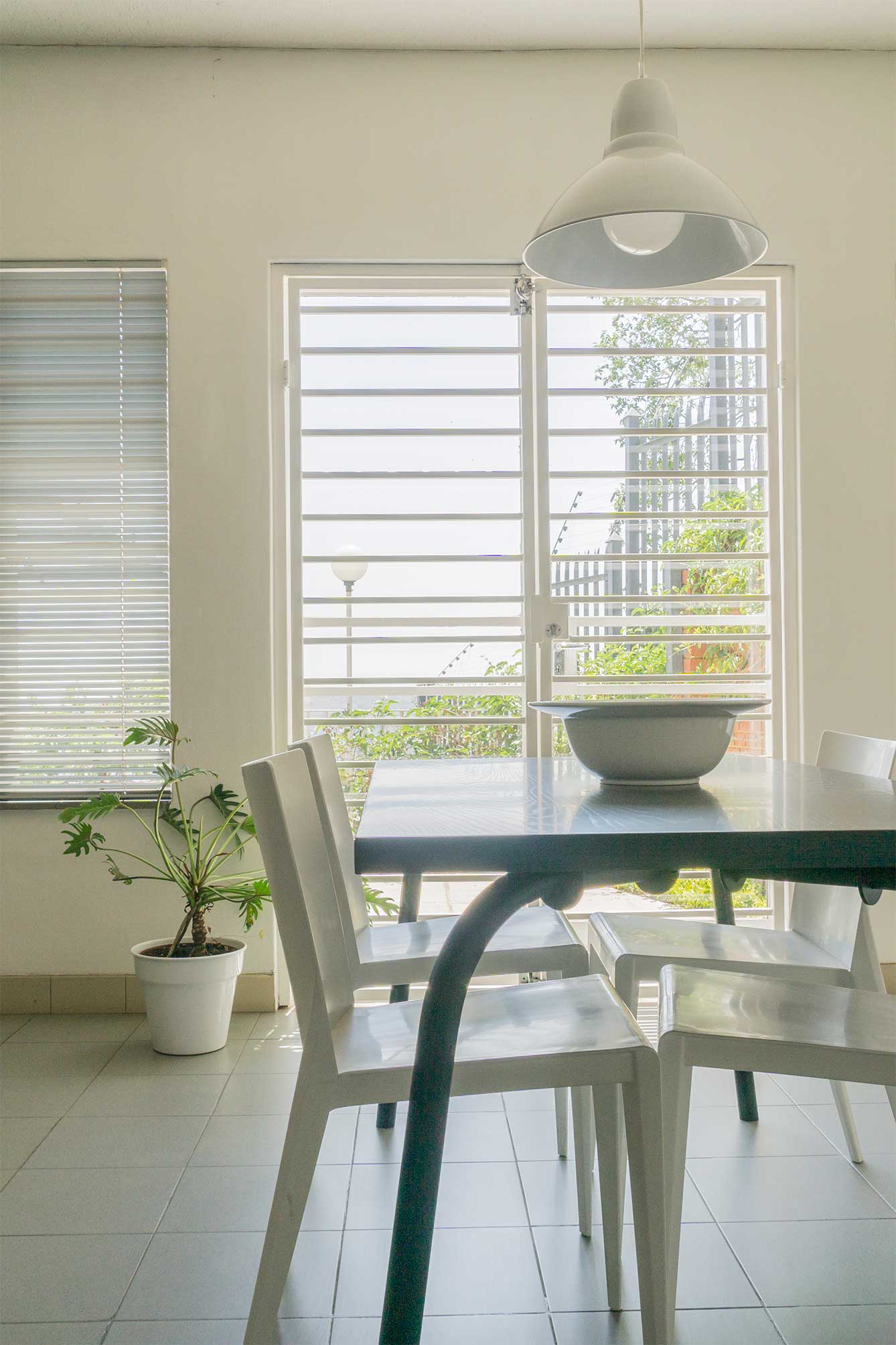
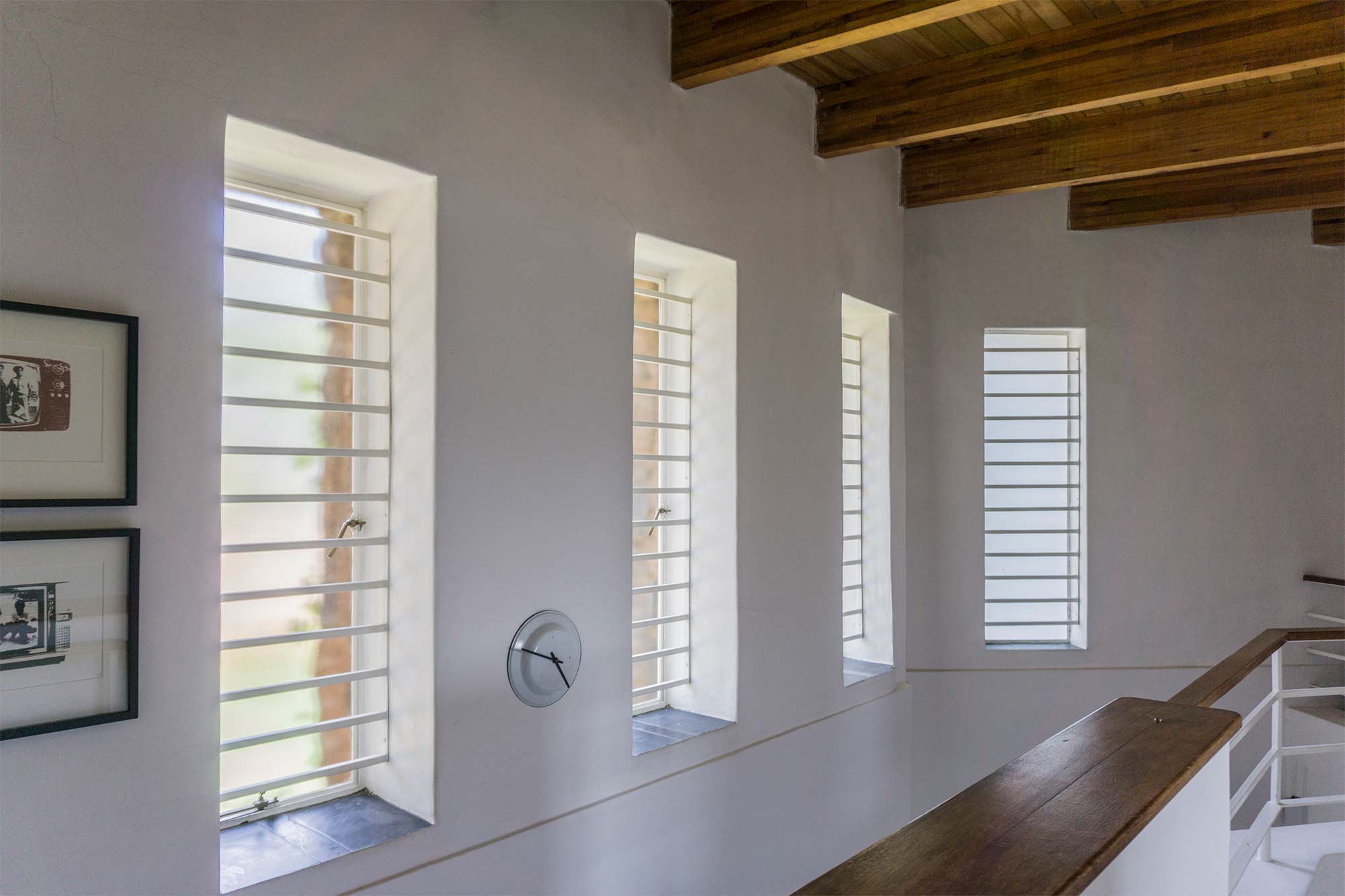
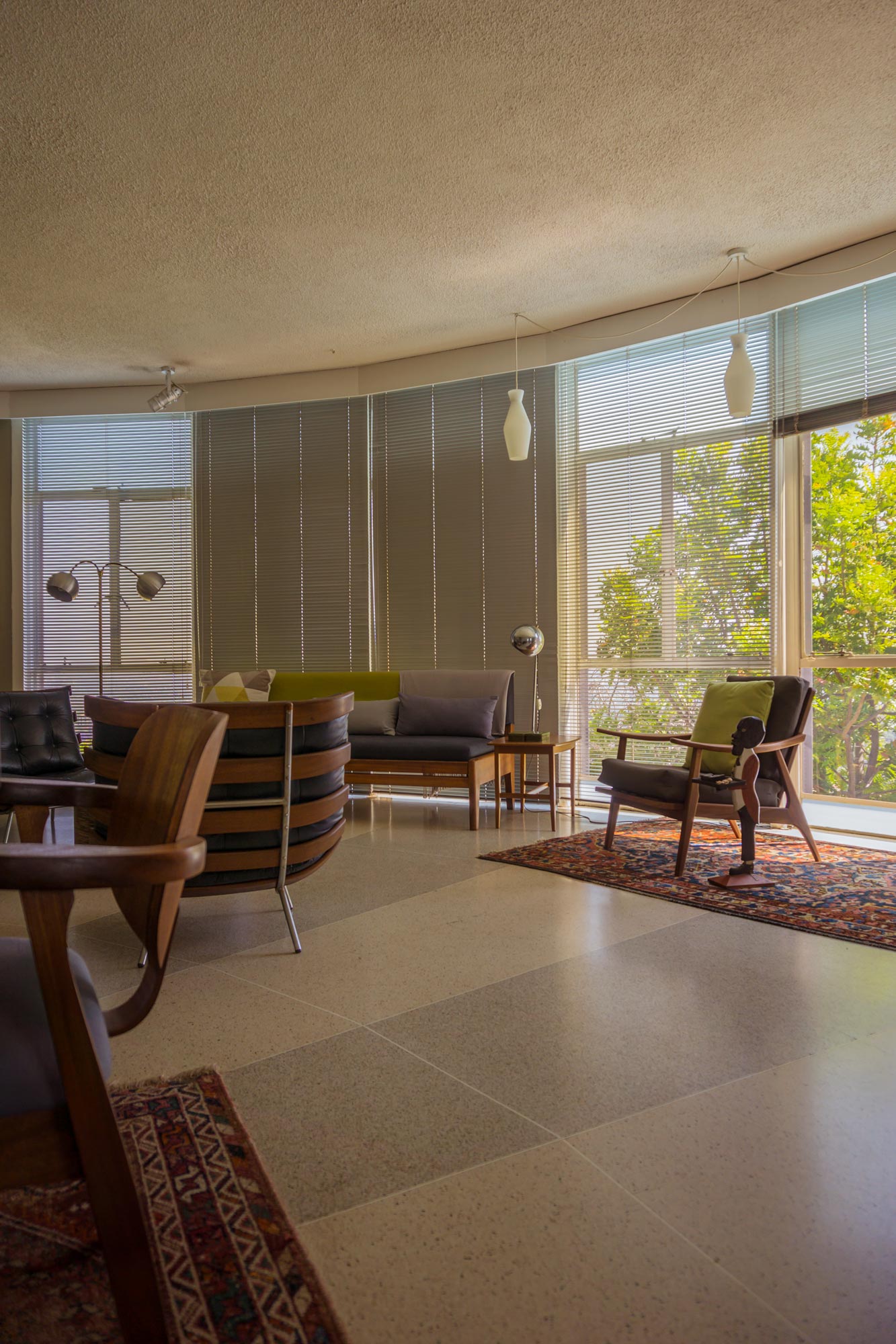
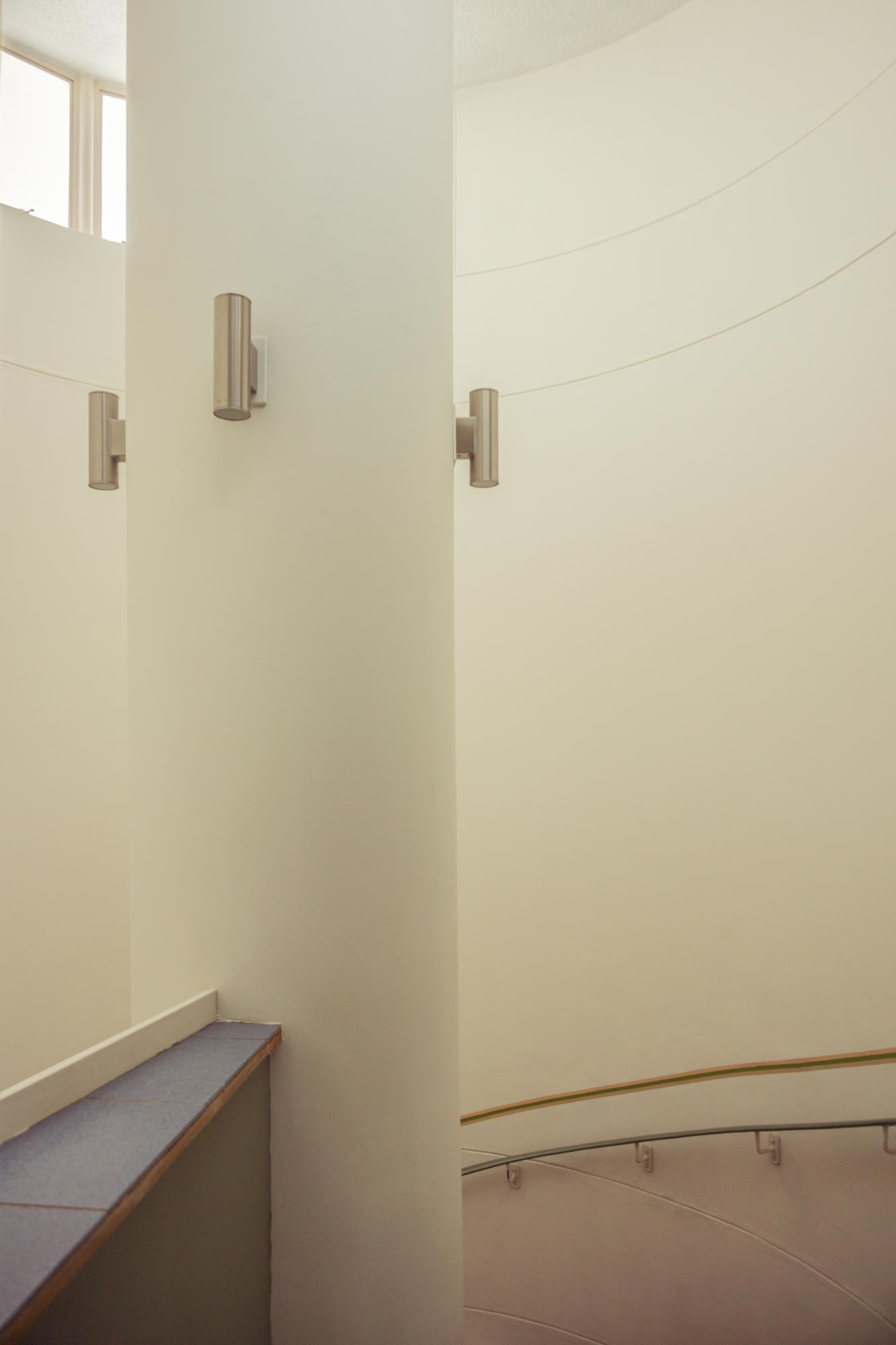
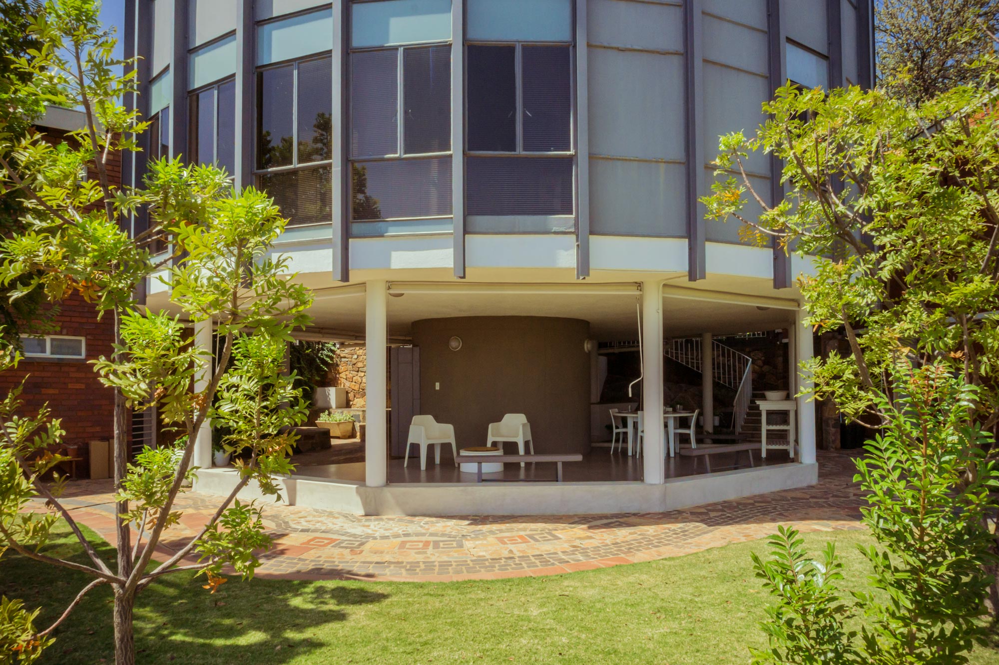
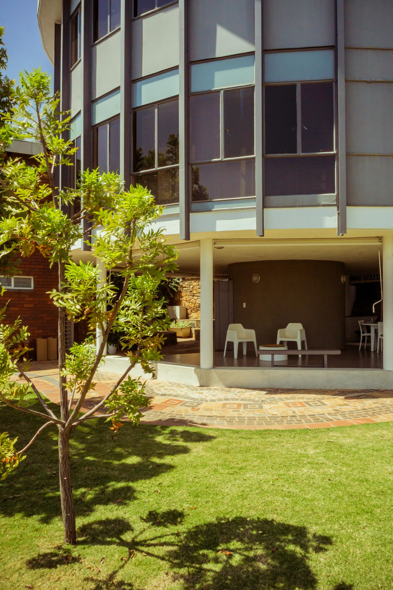
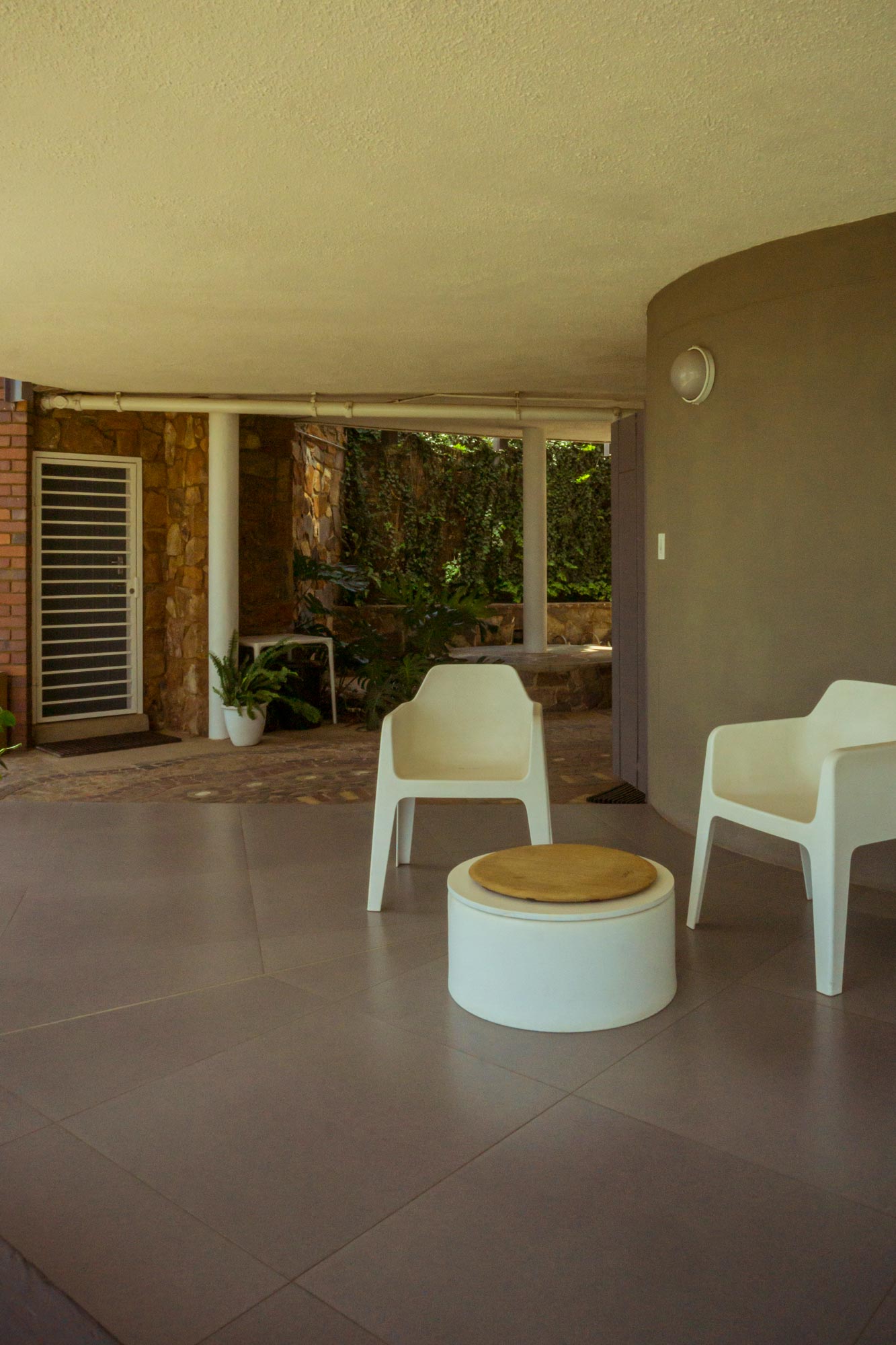
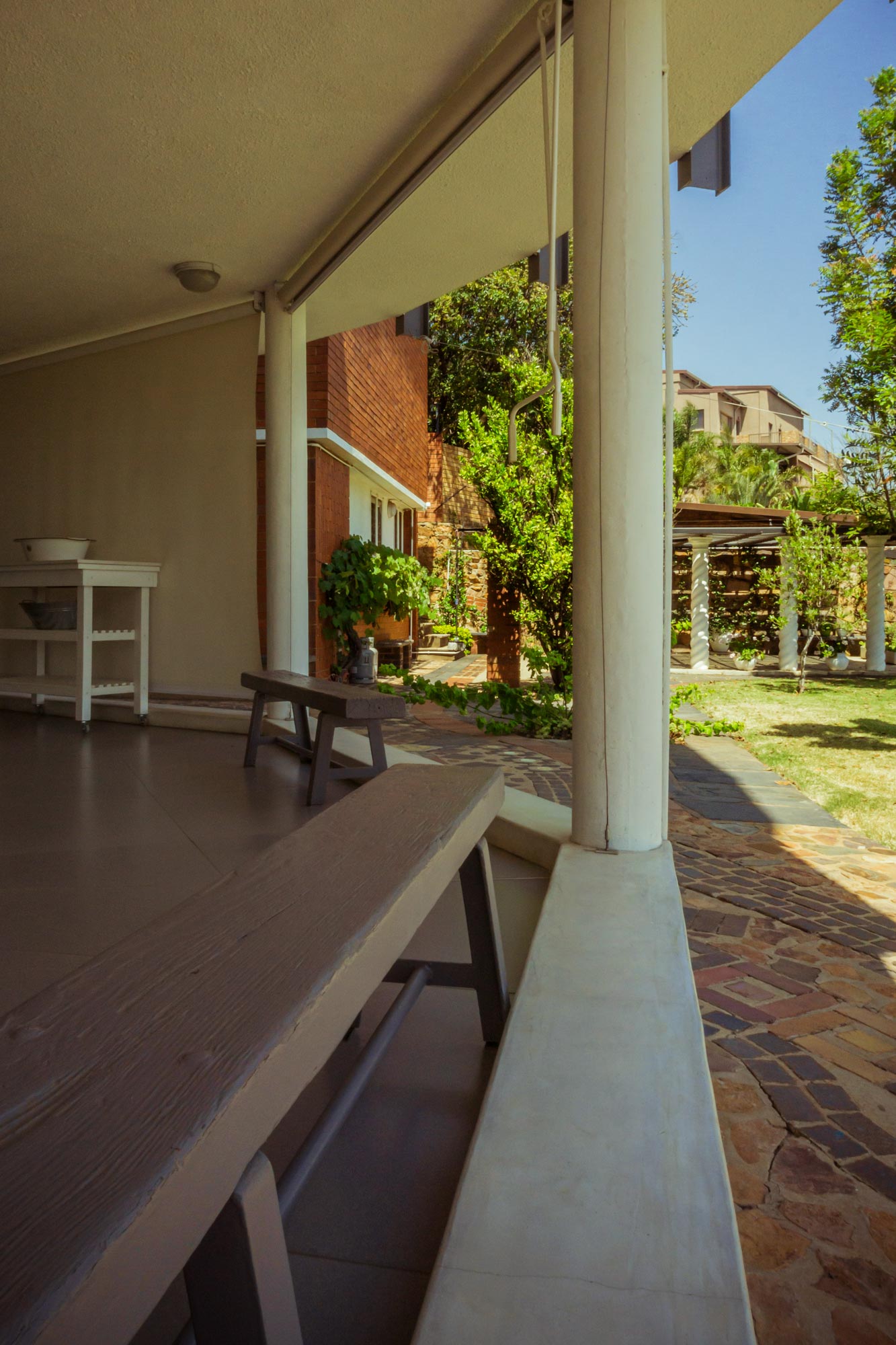
The Le Corbusier inspired “Round House”, was designed by German architect May von Langenau, for my friend’s late father and her artist mother, Margaret Nel. An exemplar of the so-called International Style of architecture, the house is noted for its spherical shape (quite a novelty at the time of construction in 1961) as well as the structure. Hoisted off the ground by supporting pilotis, the terrain extends under the house in true Le Corbusier fashion. With a radial layout instead of load bearing walls, the space provides spectacular views of the surrounding Magalies mountains.
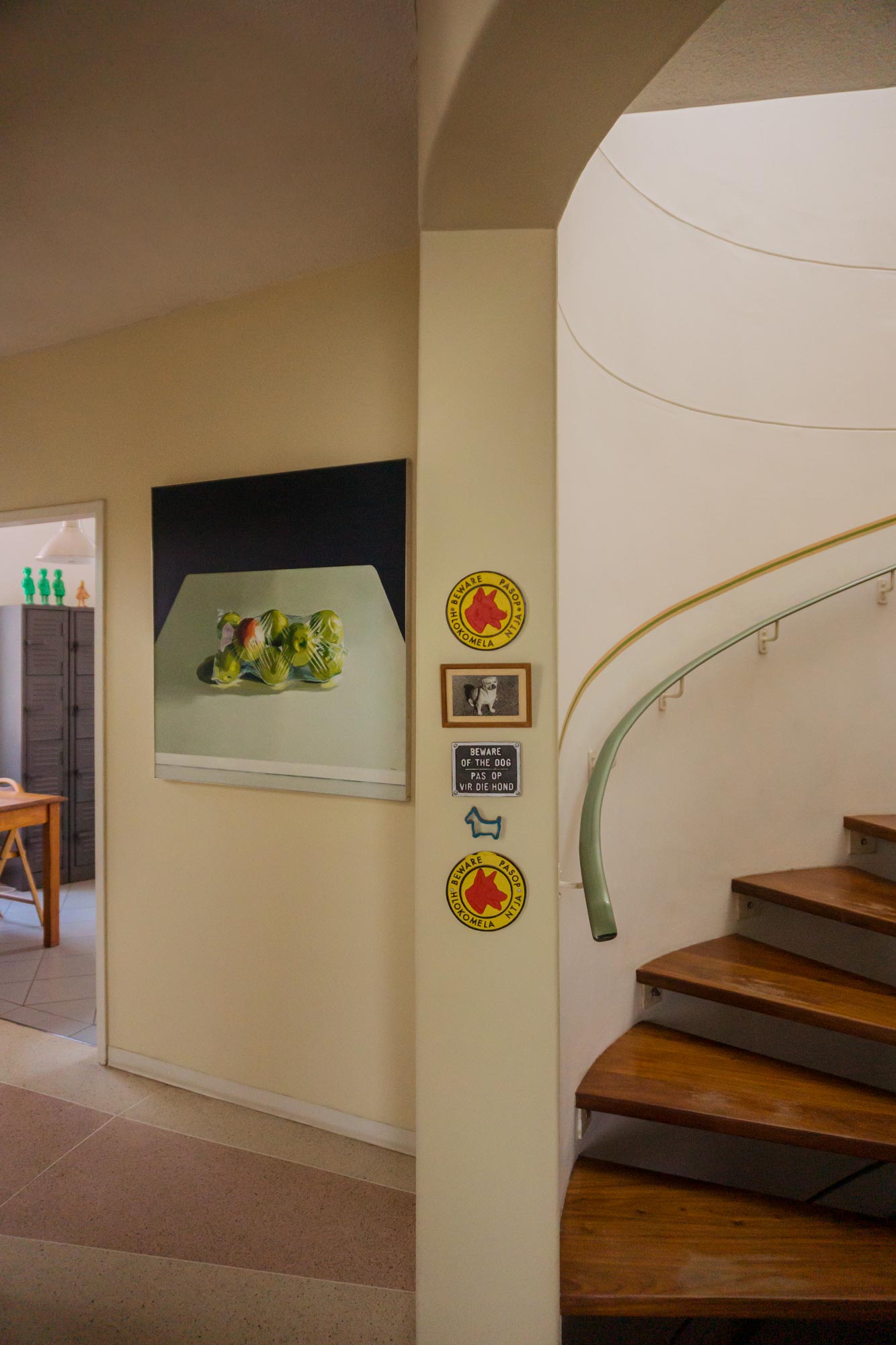
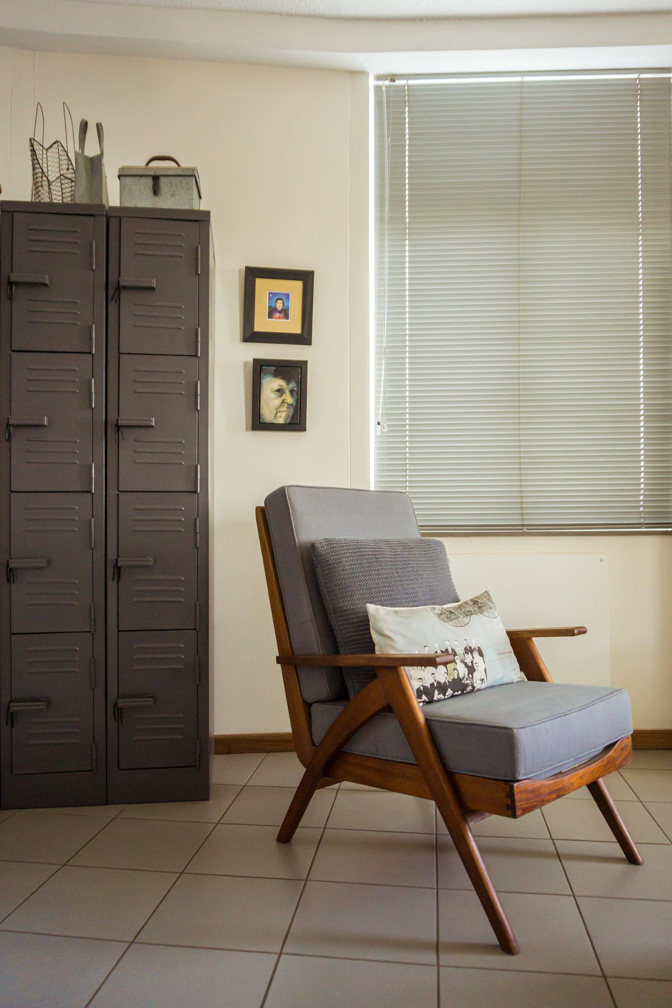
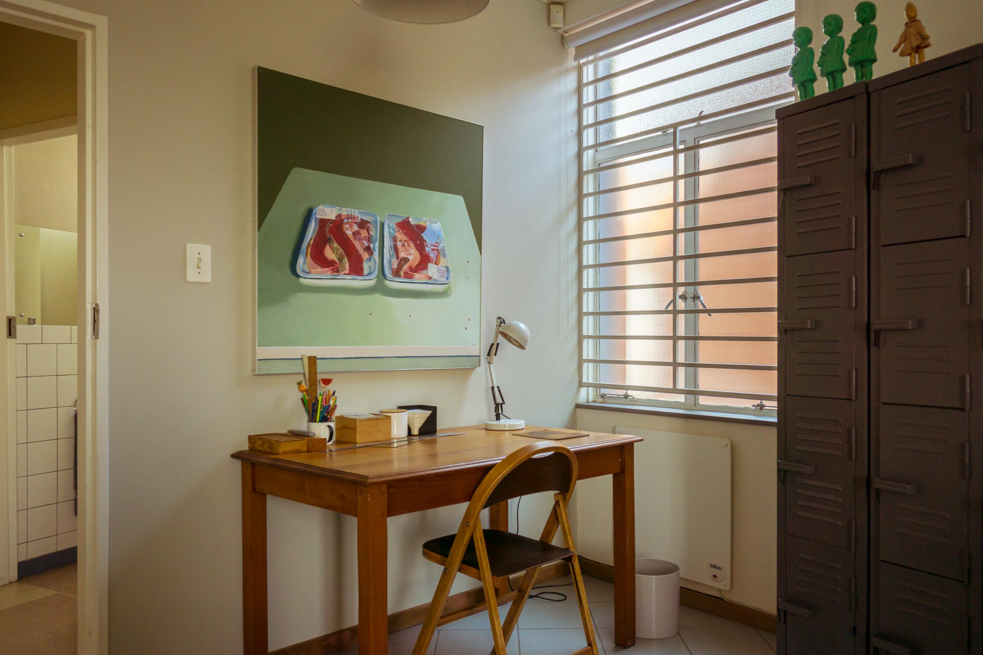
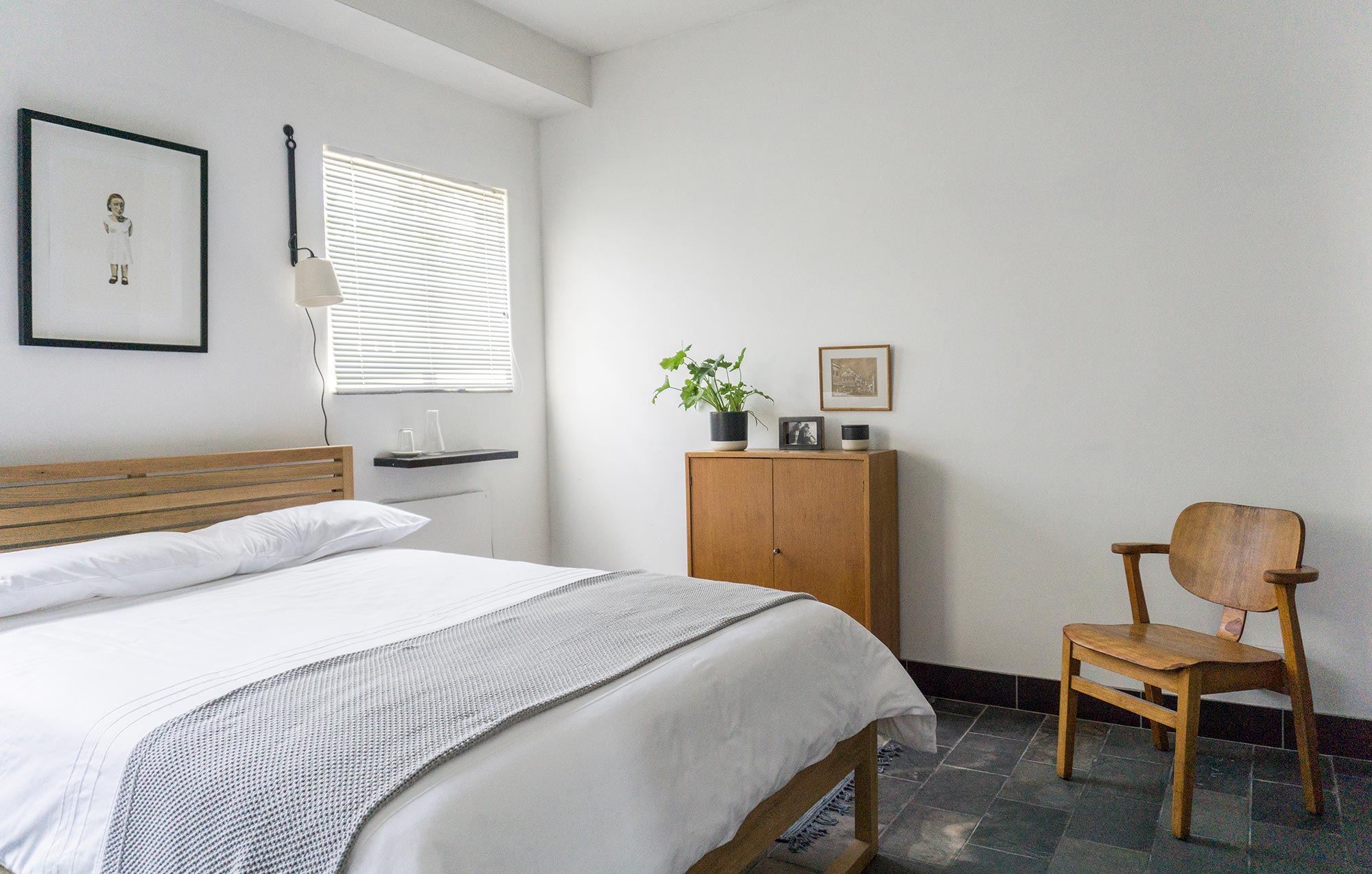
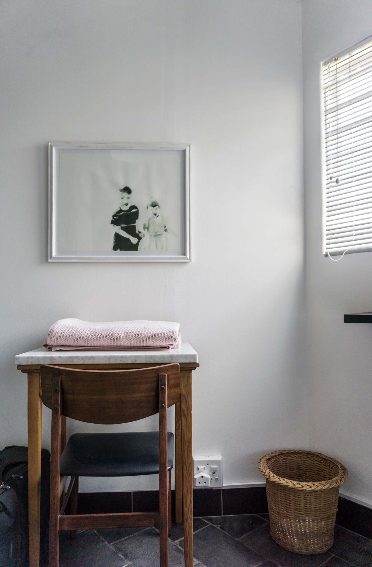
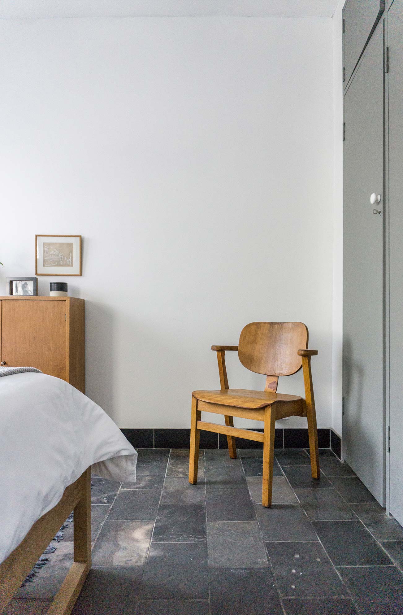
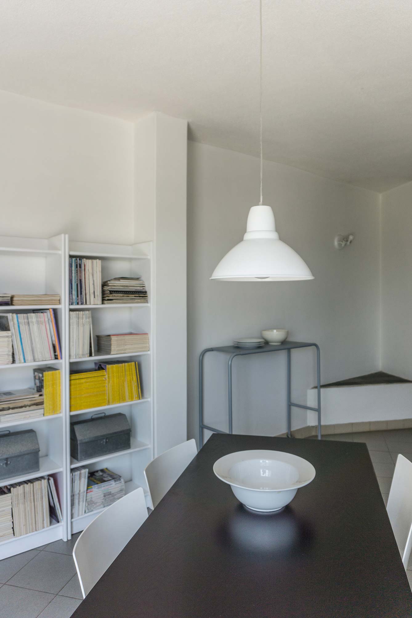
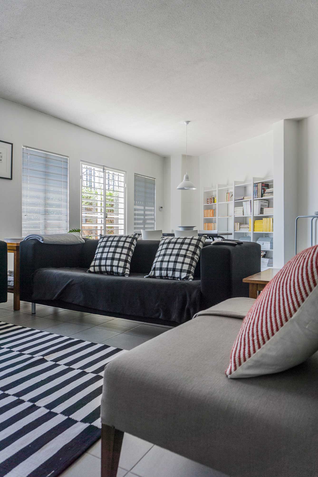
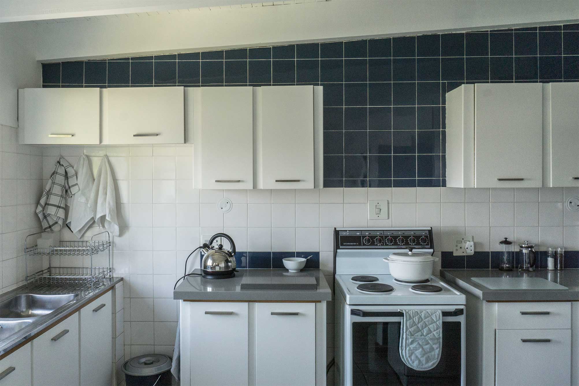
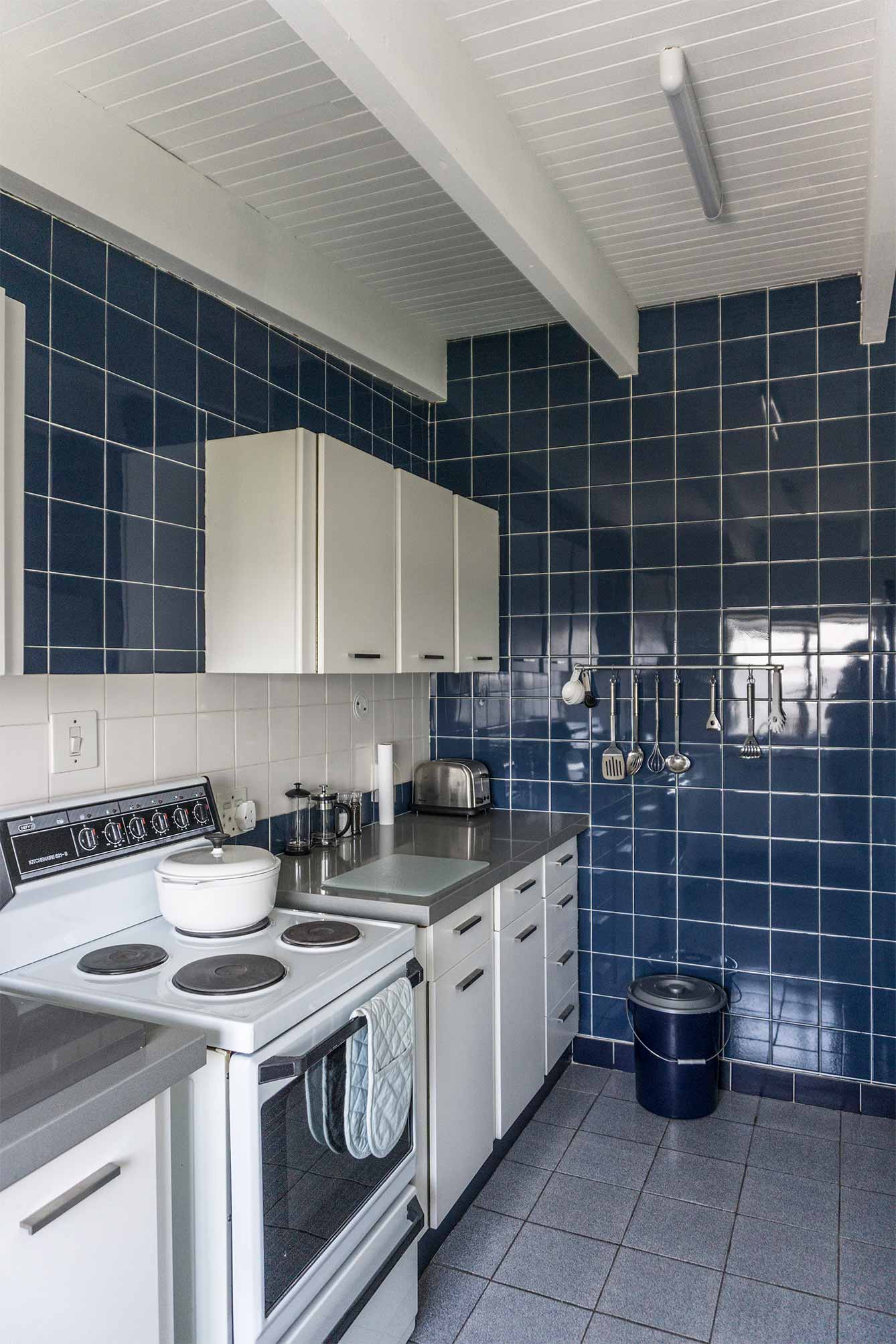
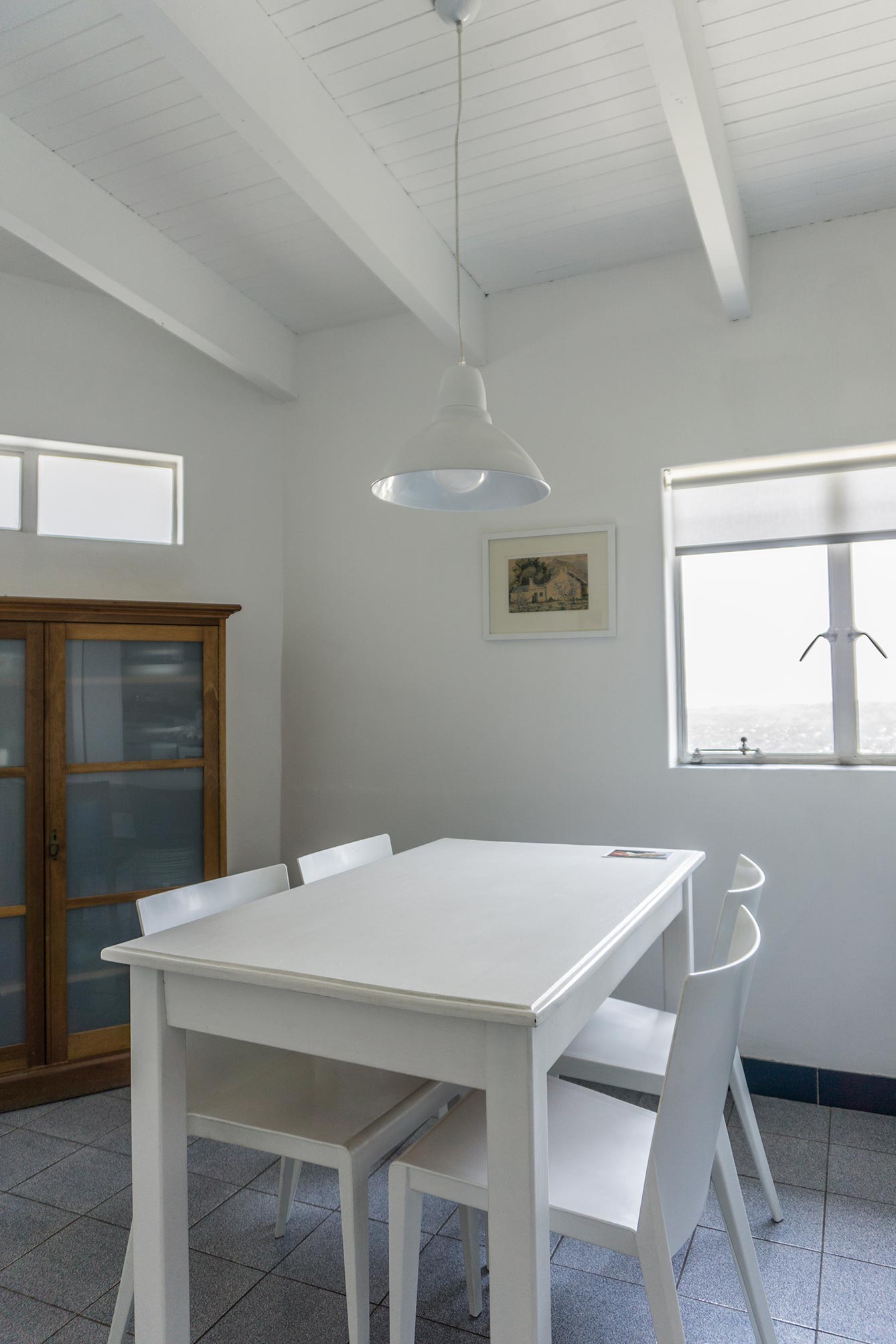
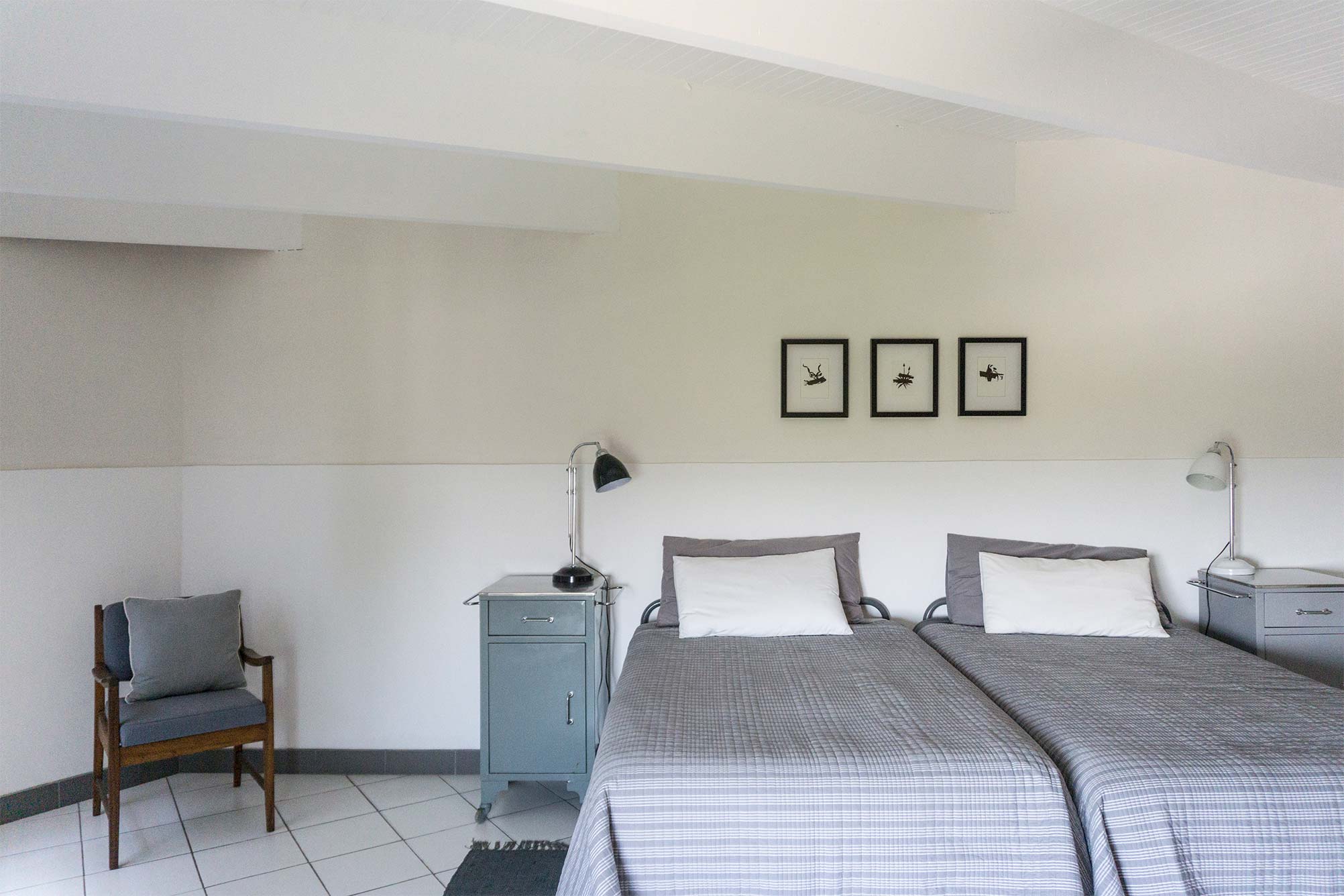
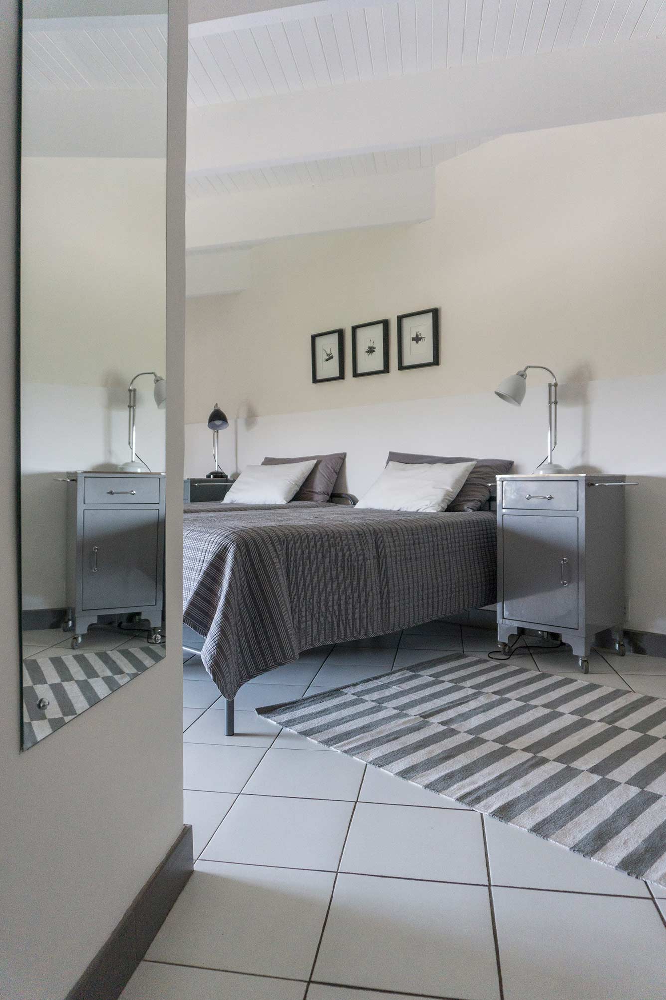
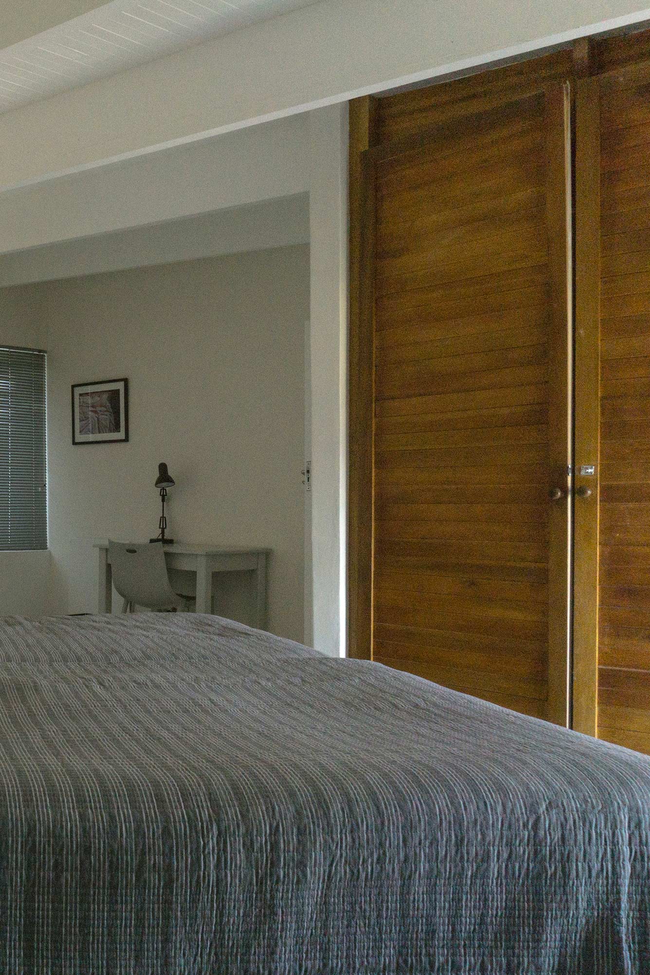
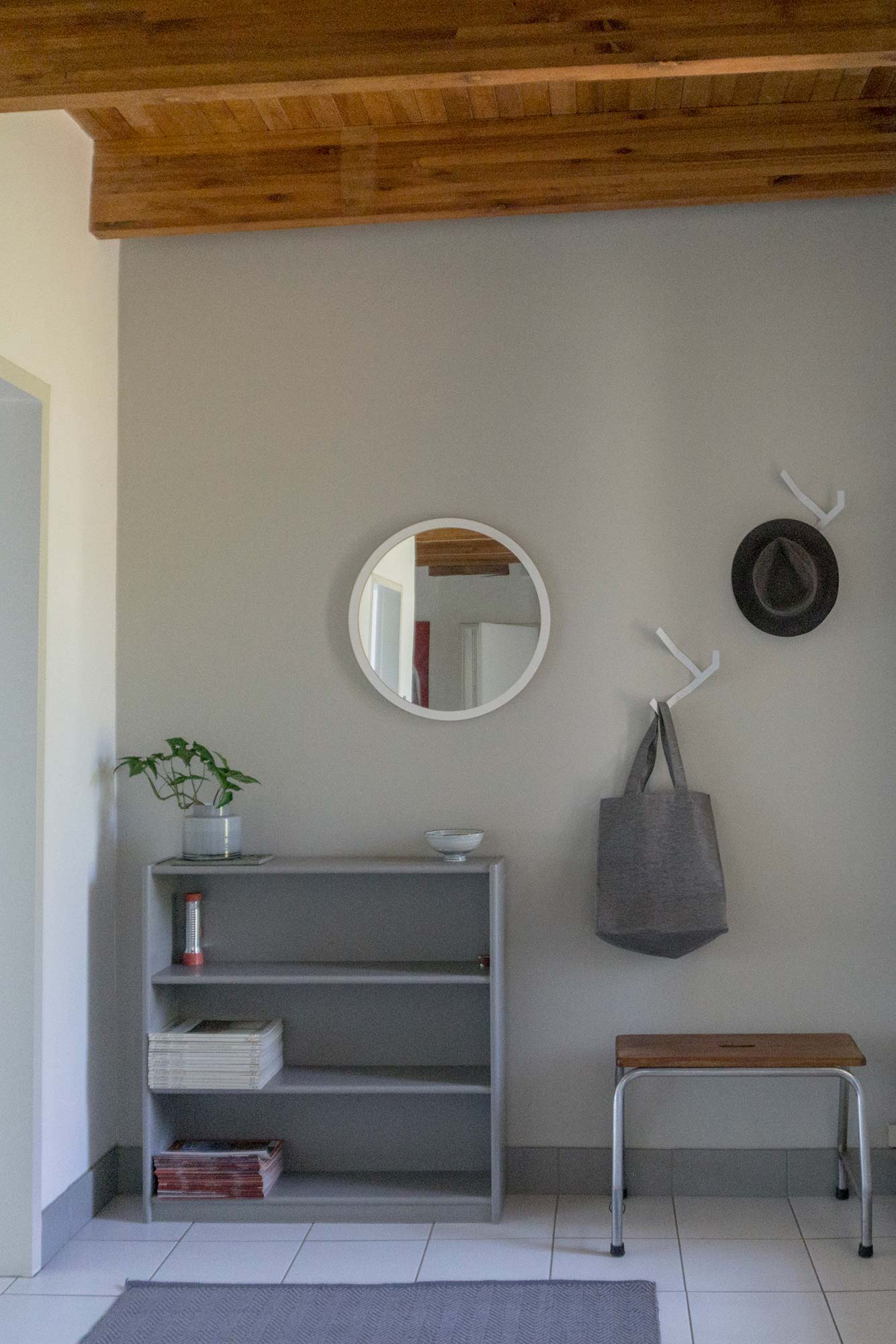
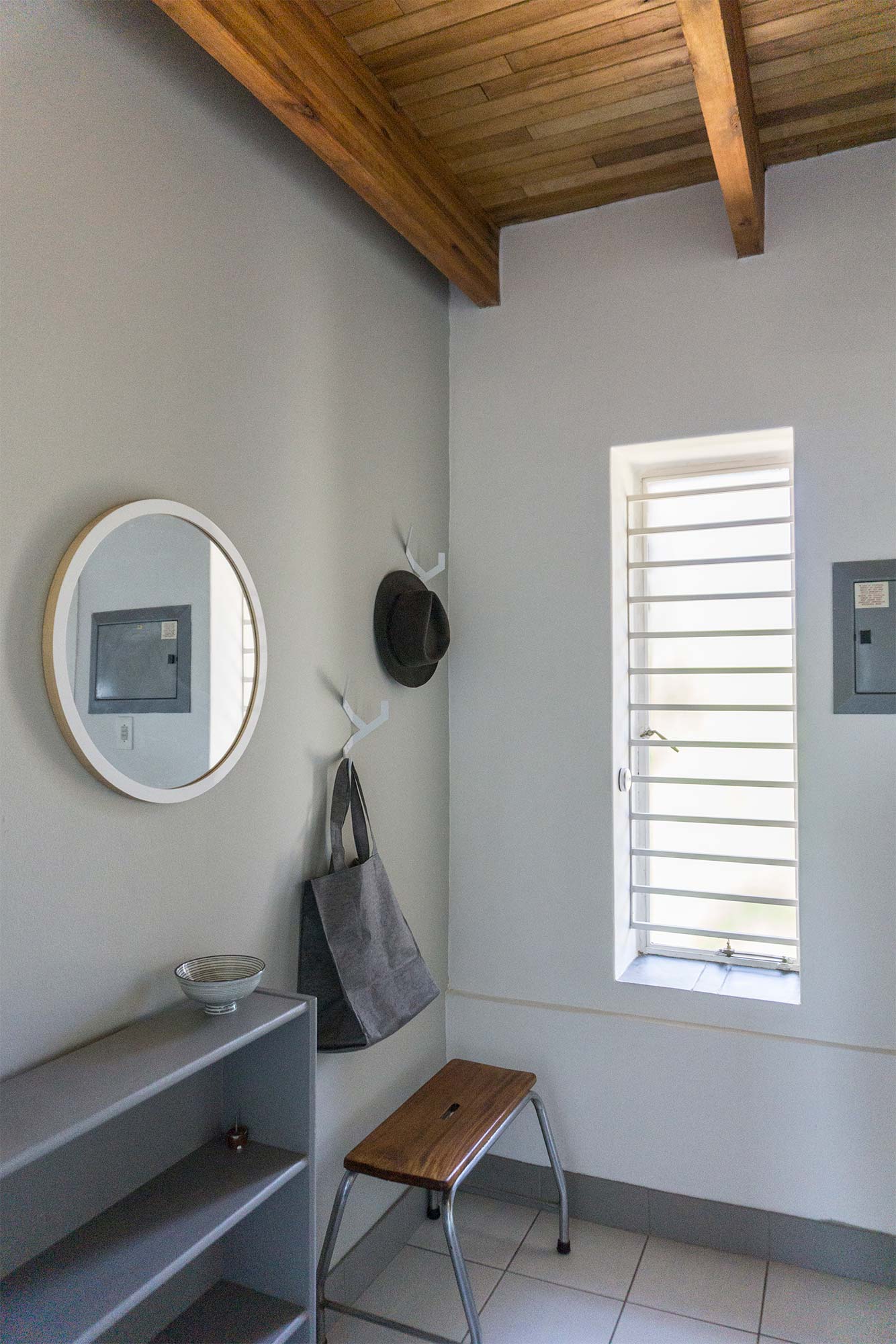
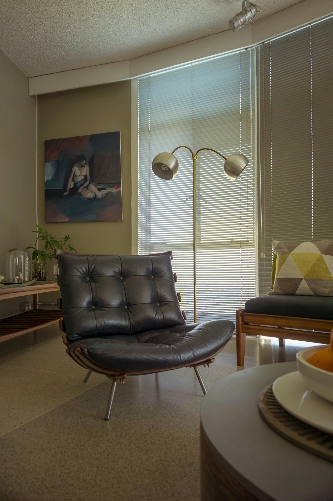
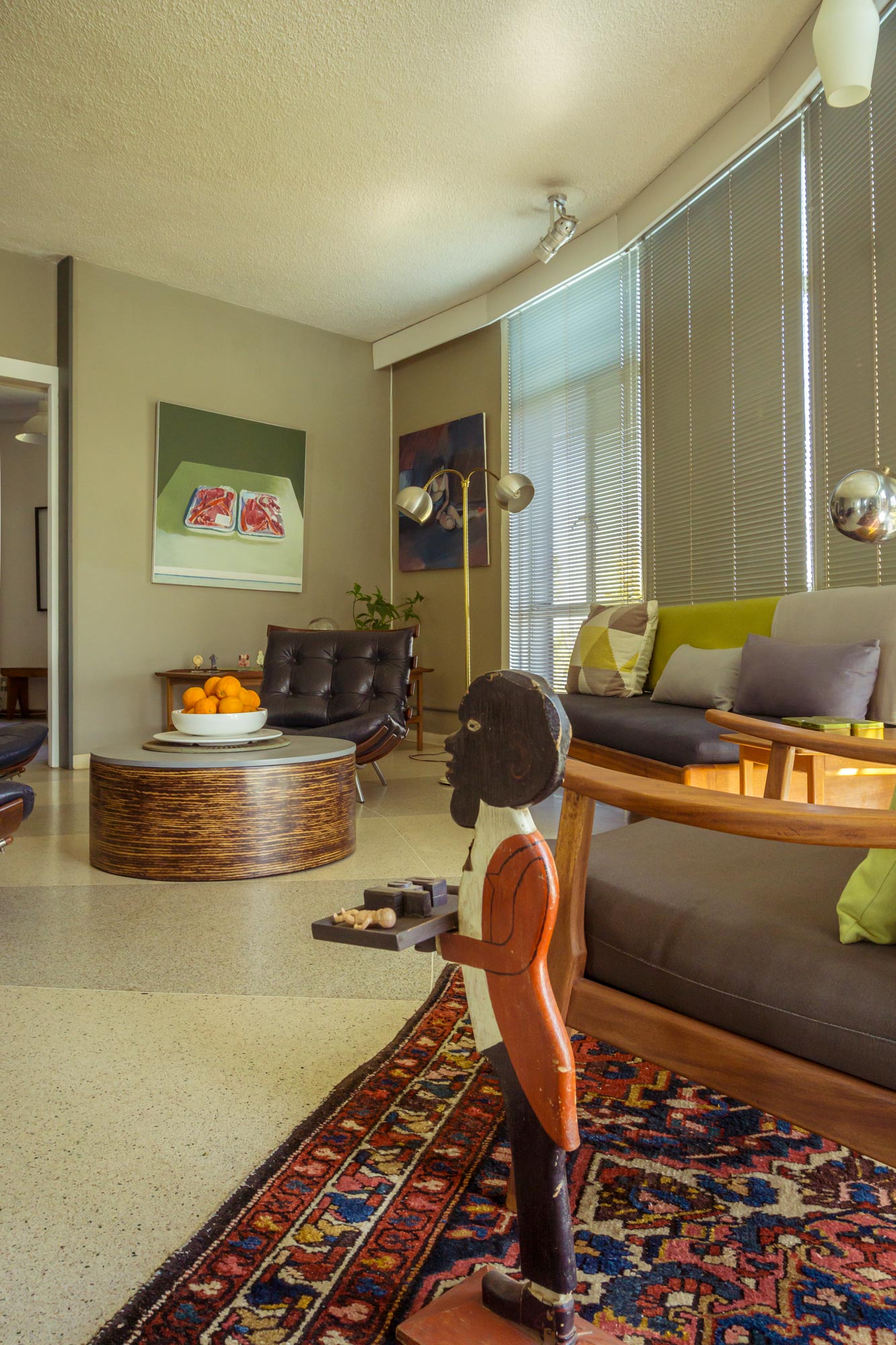
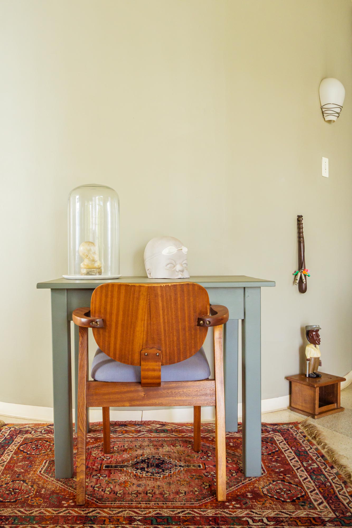
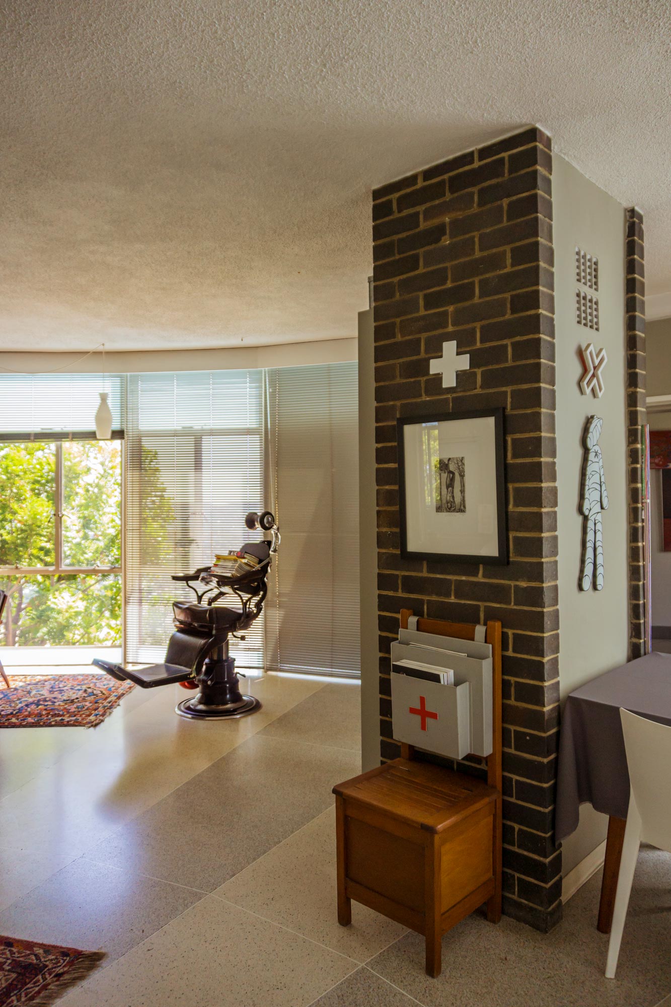
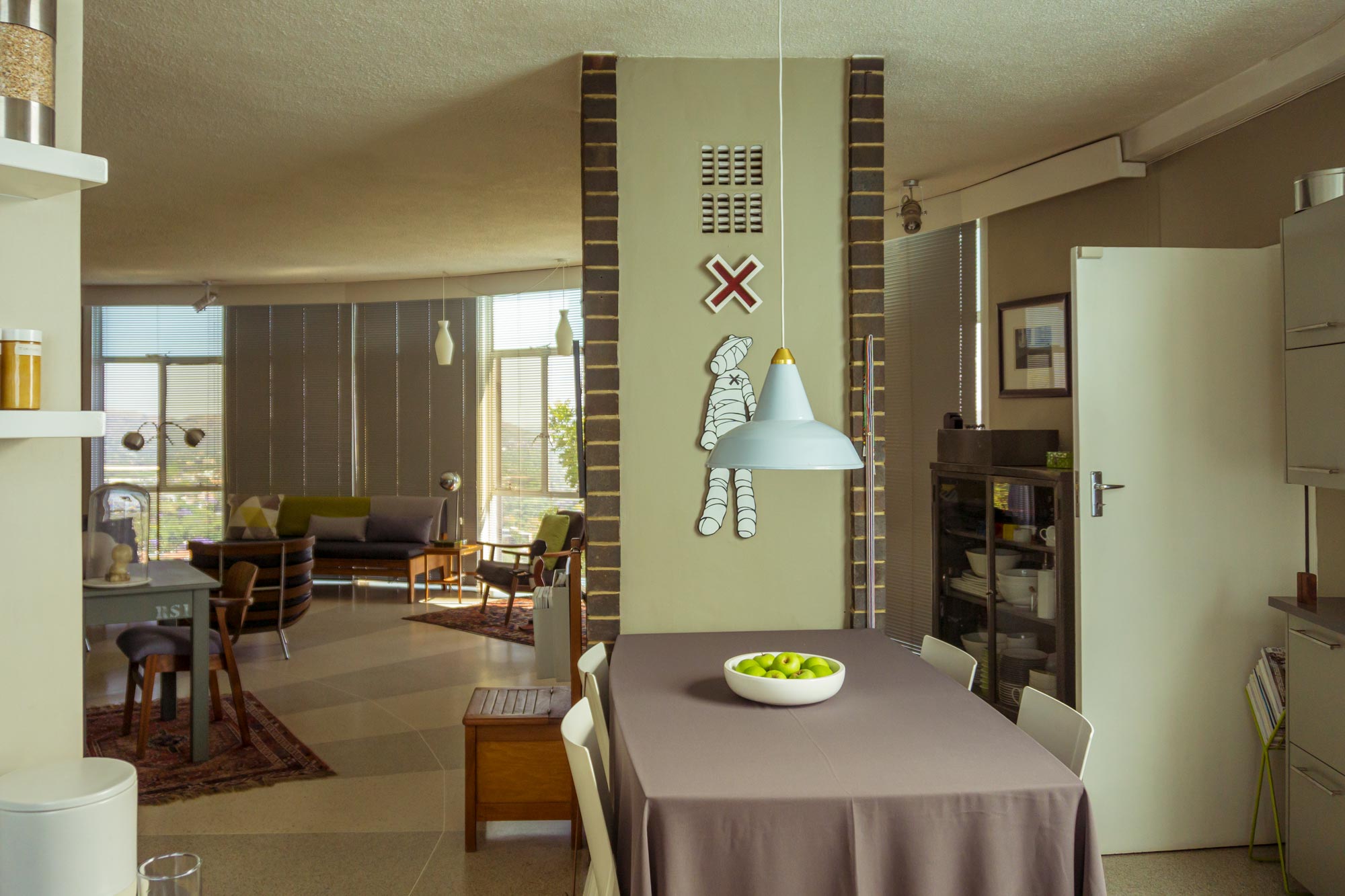
But if the view or the structure does not amaze you, the interior will. Nel has done an incredible job at curating the space. Every detail has been carefully thought out, every piece telling its story. Old iron hospital beds, -trollies and -lockers add to an industrial theme that feels surprisingly warm and modern thanks to accompanying second-hand, mid-century pieces sourced at great length by Margaret.
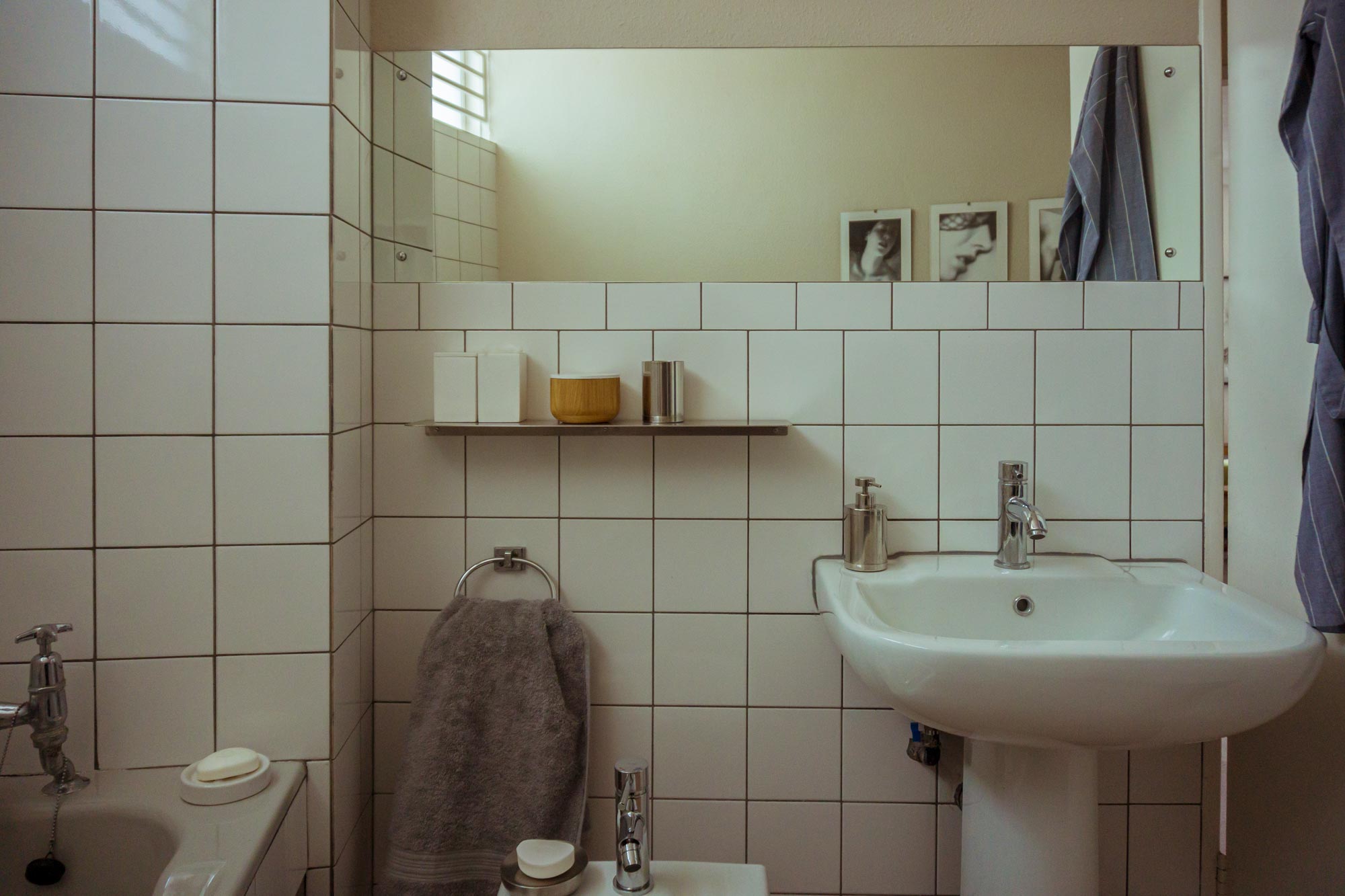
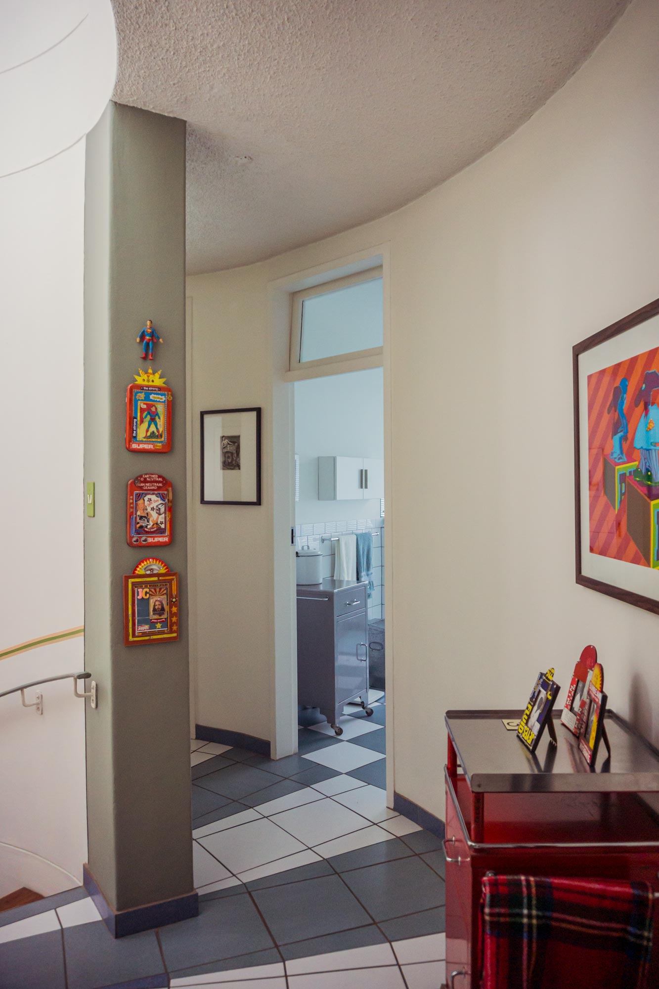
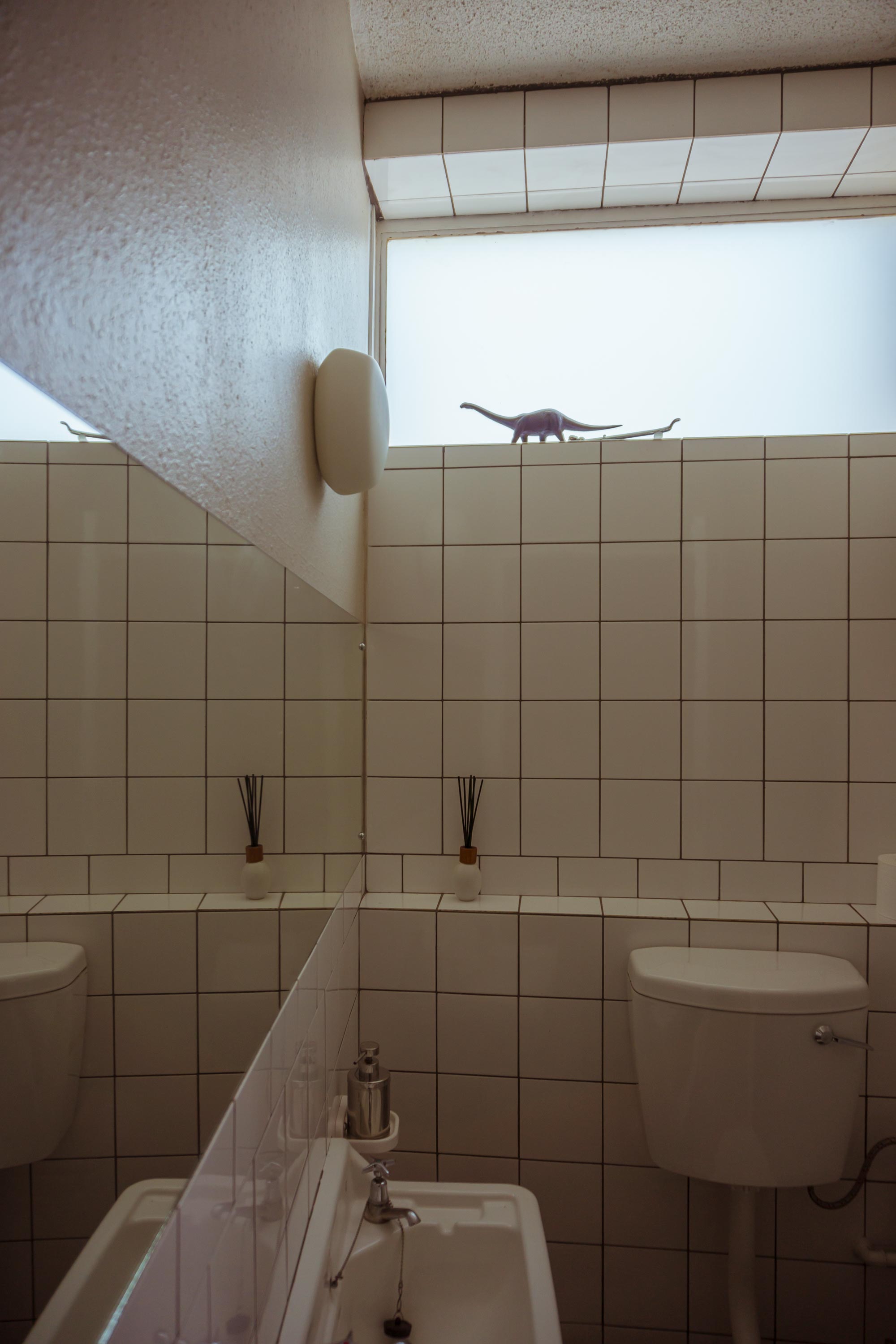
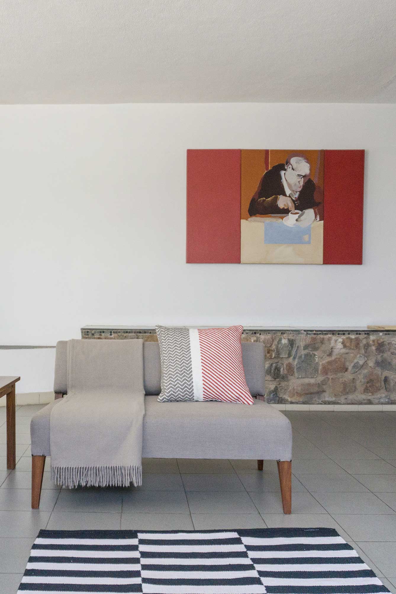
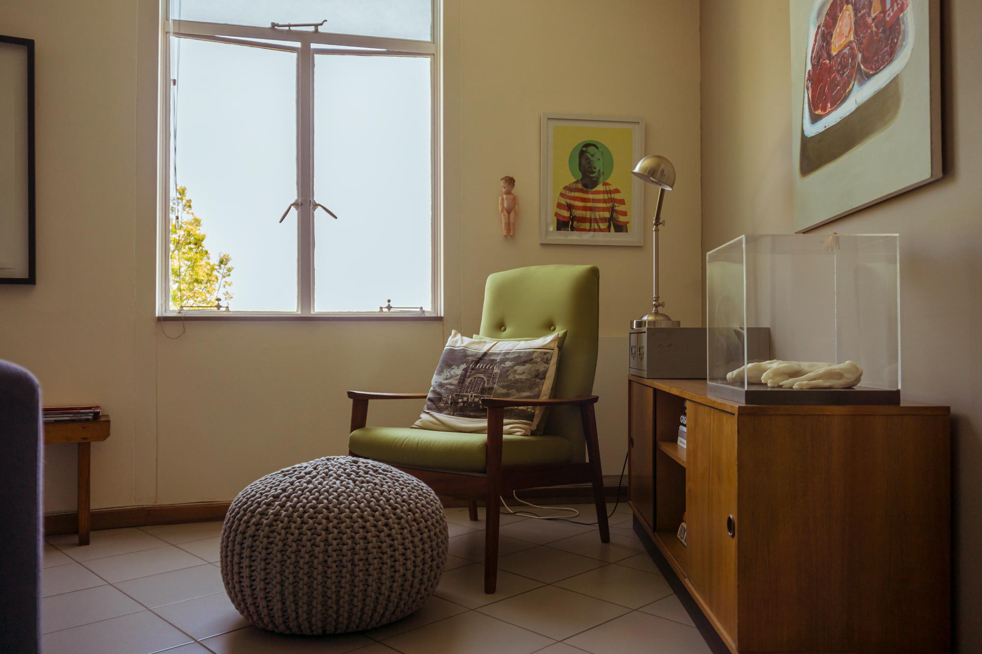
An interesting dialogue between the decor and artwork is evident throughout the interior. Among the works of esteemed artists like Claudette Schreuder and Diane Victor, peculiar artefacts like plastic dolls and dinasours, wooden sculptures and vintage mannequins, transform the house into an artwork itself.
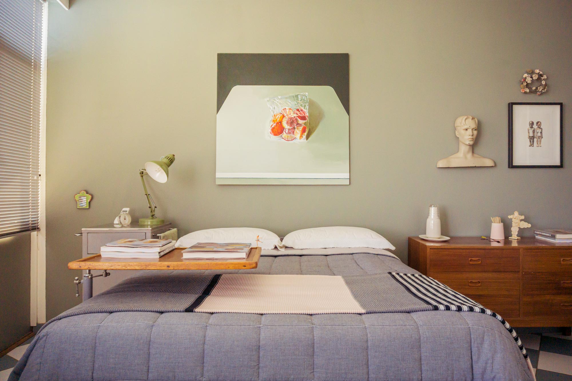
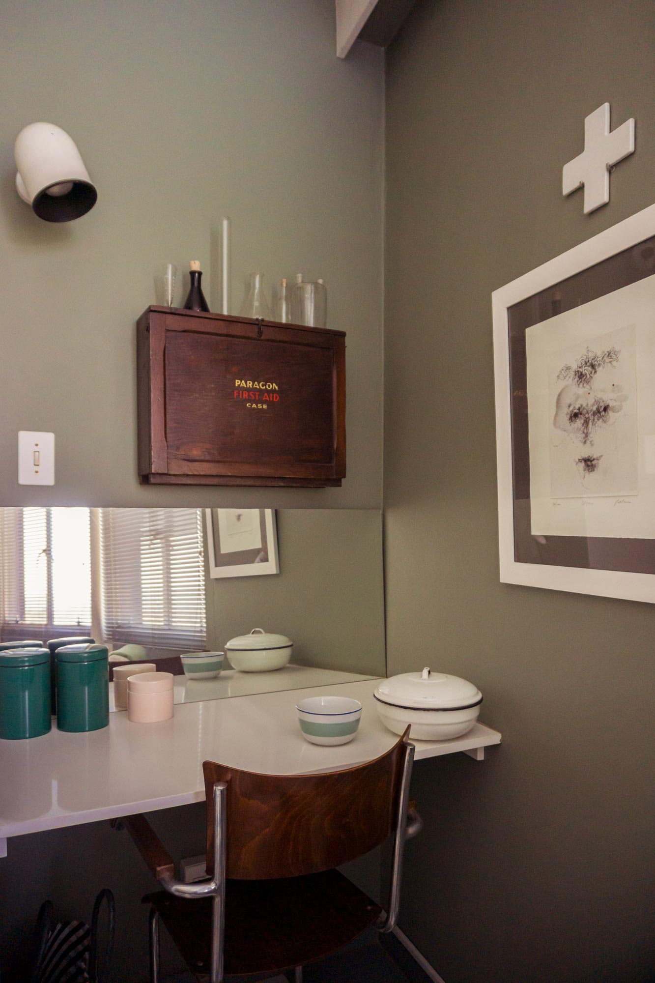
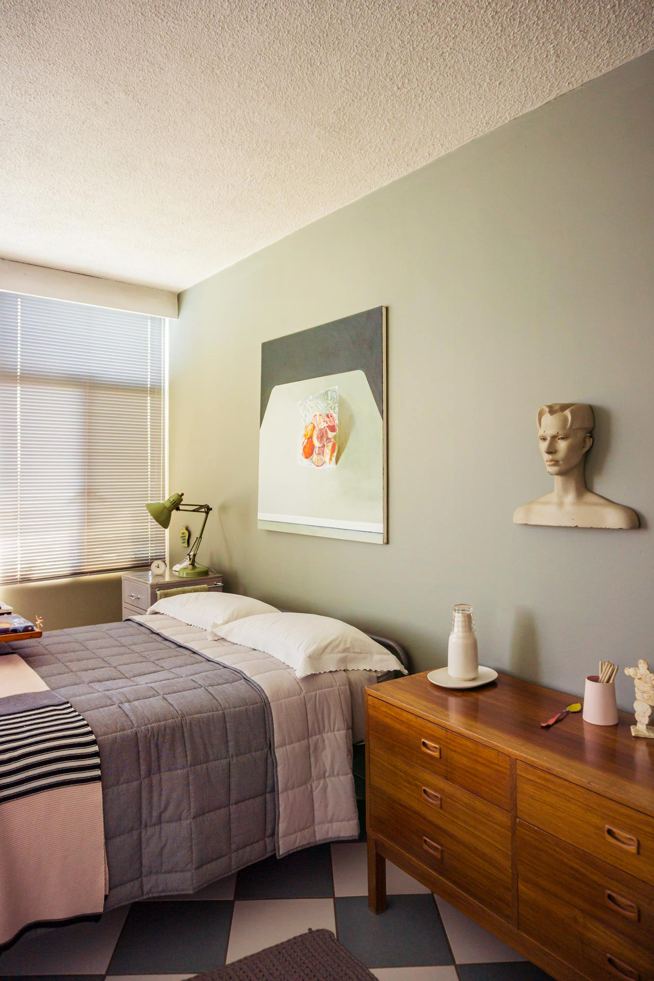
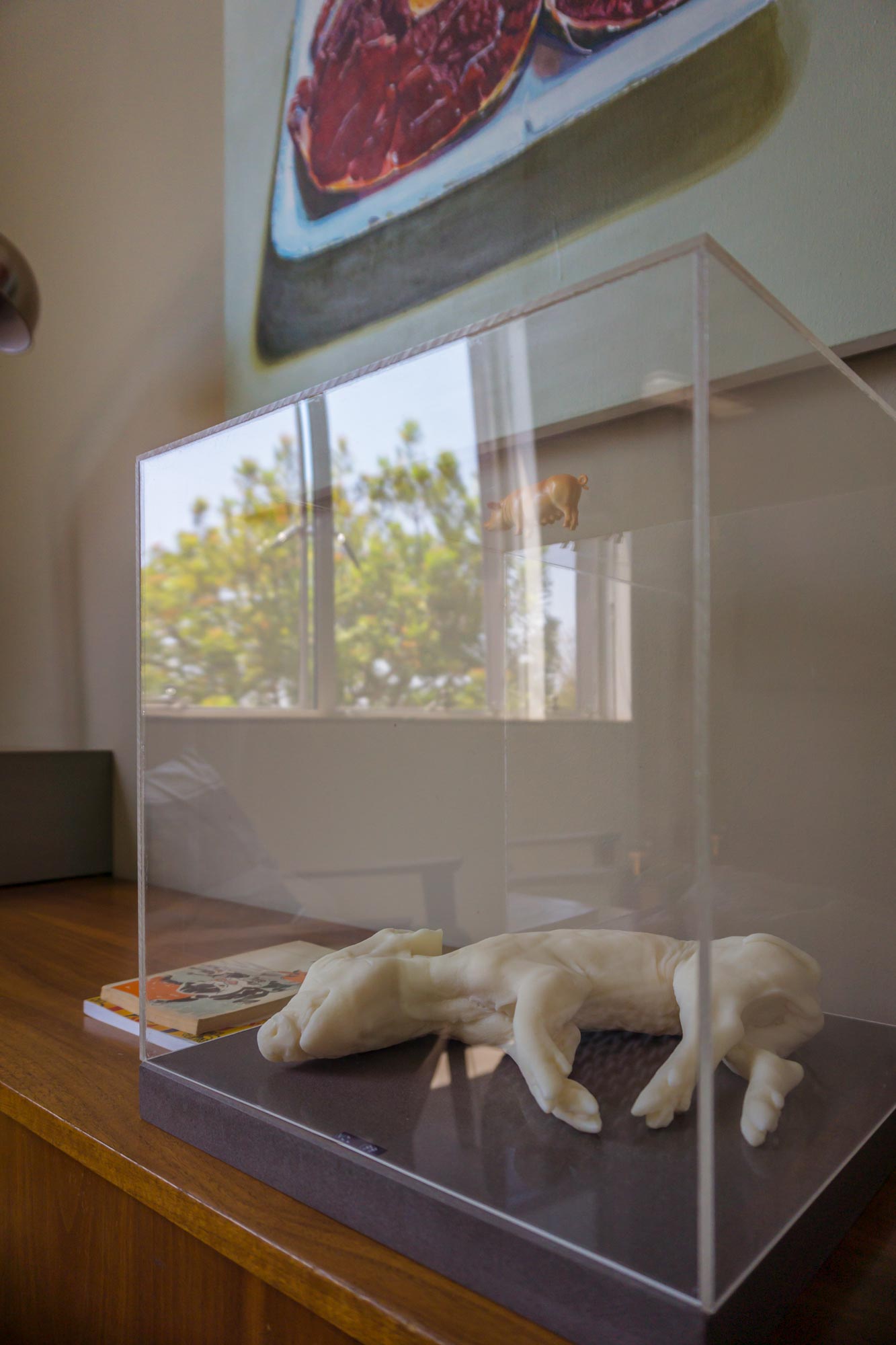
The clever displays feel like a running commentary of artistic expression. It’s at the same time sensitive and quirky; a dualism of sorts, between a bright and colourful South African vernacular, and a muted European design sensibility. Nel’s own work is on display as well. Pieces from her “Best Before” series (oversized life-like renderings of meat and confectionary wrapped in plastic and styrofoam) continues the dualistic notions, in this instance, of preservation and decay.
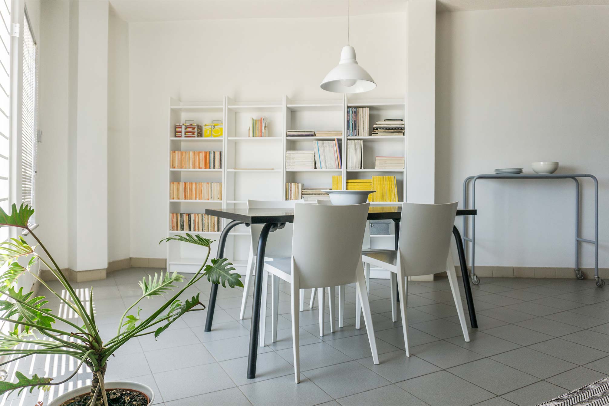
The house itself feels, as it were, like a juxtaposition. It’s at once classic and modern, off-beat and stylish. And so in answer to my childhood daydreams, the round house is undoubtedly eccentric. An elegant expression of Margaret Nel’s keen design sensibility, her prowess as an artist and her fine sense of humour. Check out the piece on minimalism to see the Anex to the house.
Text & Photography © Barbara Cilliers
Wild about interiors?
Sign up to the newsletter for more inspirational content and stepping into beautiful spaces.